
Choosing the right resume font feels like a small decision until you look at how resumes are actually judged.
A recruiter opens a file and, within seconds, the document already feels either clean, modern, and easy to trust, or cramped, dated, and harder to scan. That reaction happens before they have even read your achievements.
It is part of the broader issue of hidden bias in resume formatting, where visual presentation shapes perception before the substance gets a fair look. The same is true when your resume moves through an applicant tracking system.
The font itself is rarely the problem. Readability is.
That is why the best resume fonts in 2026 are not the flashiest ones. They are the ones that stay professional, render cleanly, and help your experience feel easy to absorb on both desktop and mobile screens. In other words, the best ATS-friendly resume fonts are the fonts that remove friction. Many university career centers still recommend simple, professional fonts, clean spacing, and sensible sizing over anything overly styled. See guides from Berkeley Career Engagement, UNC Career Center, and Penn Career Services.
In this guide, we will cover the best resume fonts to use in 2026, what “ATS-friendly” really means, how serif and sans-serif fonts compare, and the ideal font sizes for each part of your resume so the final result looks polished without trying too hard.
The best ATS-friendly resume fonts in 2026
The short answer is this: the best resume fonts in 2026 are clean, standard, and highly readable. For most people, that means sticking with fonts such as Arial, Calibri, Aptos, Helvetica, Georgia, or Cambria. These are not exciting in a flashy sense, but that is exactly why they work. They look professional, they read well on screens, and they do not distract from the actual content of the resume.
Arial remains one of the safest choices. It is simple, neutral, and easy to scan quickly. If you want a low-risk font that works for almost any industry, Arial is still one of the best answers. Calibri has a similar advantage. It feels a little softer and more modern than Arial, which is why it stayed popular for years in professional documents.
Aptos is another strong option if you want something modern and polished without looking trendy. Since Microsoft made Aptos the default Office font, it now feels current and familiar rather than experimental. You can see that shift in Microsoft’s own Aptos font documentation.
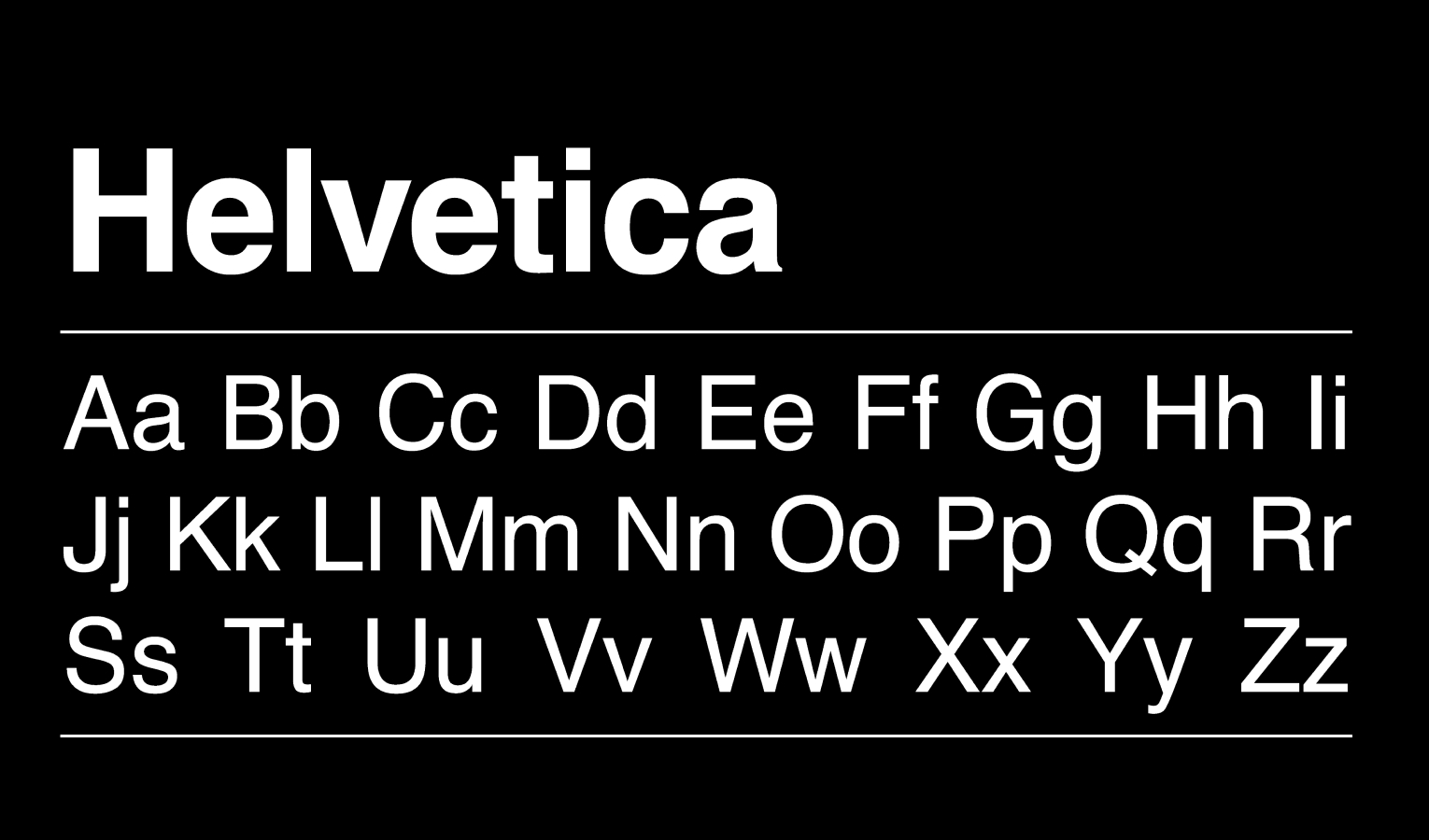
Helvetica works especially well for candidates who want a sharper, cleaner feel. It has that crisp sans-serif look many people associate with tech, product, startup, and digital-facing roles. On the serif side, Georgia and Cambria are strong choices for people who want something more classic. They can work especially well for legal, academic, executive, or finance resumes where a slightly more traditional tone fits the role.
If you want the simplest recommendation, use one of these three depending on the tone you want:
- Arial for safe and universal
- Aptos or Calibri for modern and balanced
- Georgia for classic but still readable
What matters most is not finding a “secret” ATS font. It is choosing a font that looks current, reads easily, and keeps attention on your experience instead of your formatting. A great resume font should feel invisible. It should help the reader move through the page smoothly, not make them notice the font itself.
For most job seekers, the best move is to stop searching for something clever and choose something proven. Clean beats creative here almost every time.
What “ATS-friendly” really means
A lot of job seekers hear the phrase “ATS-friendly” and imagine some mysterious robot rejecting resumes because the font was not approved by some secret committee.
That is not really how this works.
An ATS usually does not care whether you picked Arial over Georgia because one is somehow blessed and the other is not. What matters more is whether the resume is easy to read, easy to parse, and free from formatting choices that create confusion. Clean fonts help with that. So does a simple layout. So does exporting the file properly.
That is why the safest fonts tend to be standard fonts. Not because ATS software is obsessed with them, but because they render consistently across devices and file types. They are easy for humans to read, and they are less likely to cause weird spacing or display issues when the resume is opened somewhere else. Guidance from UNC, Berkeley, and Penn all pushes in the same direction: keep the format simple, readable, and professional.
This is also where serif vs sans-serif comes in.
Sans-serif fonts like Arial, Calibri, Aptos, and Helvetica usually feel more modern and screen-friendly. They are a natural fit for most resumes today, especially in tech, operations, marketing, startup, and general business roles. They tend to look clean without much effort.
Serif fonts like Georgia and Cambria can still work very well. They bring a slightly more traditional and formal tone. That can be a good thing in law, academia, finance, or senior leadership roles where a classic presentation does not feel out of place. The mistake is not using a serif font. The mistake is using one that feels old, cramped, or too formal for the role you want.
So when people ask what makes a font ATS-friendly, the real answer is simple: a font is ATS-friendly when it supports clarity.
That means readable letters. Reasonable spacing. No decorative styling. No tiny text squeezed into the margins. No resume that looks like a graphic design experiment when it should look like a professional document.
The font is just one part of that. If you zoom out, what resume formatting actually includes goes far beyond font choice alone. It also covers spacing, section hierarchy, dates, alignment, and overall presentation.
But it is an important part because it shapes how the entire resume feels in the first few seconds.
Best resume font sizes by section
Picking the right font matters.
Picking the right size matters just as much.
This is where many resumes quietly go wrong. The candidate chooses a decent font, then shrinks everything too much to force more content onto one page. Or they make headings huge, body text tiny, and the whole document feels unbalanced before anyone reads a single bullet.
For most resumes, the safest body text size is 10.5 to 12 pt. If you want one default recommendation, go with 11 pt. It is usually the sweet spot. Easy to read, compact enough to fit solid content, and still comfortable on screen. That lines up closely with recommendations from Berkeley, UNC, and other university resume guides.
Here is a practical size guide that works well for most resumes:
- Your name: 18 to 24 pt
This should stand out immediately, but it should not dominate half the page. Large enough to establish hierarchy. Not so large that it feels theatrical. - Contact details: 10 to 11 pt
Email, phone, LinkedIn, city. Keep it readable but secondary. This info should support the page, not compete with your name. - Section headings: 12 to 14 pt
Headings should create a clear visual path through the resume. They need enough contrast from the body text to help scanning, but they should still feel restrained. - Job title and company line: 11 to 12 pt
This line carries a lot of weight because recruiters skim it fast. It should be slightly more prominent than the bullets underneath. - Body text and bullet points: 10.5 to 12 pt
Again, 11 pt is usually the safest choice. You can sometimes use 10.5 pt if the font reads clearly and the spacing is good. Going down to 10 pt can work, but only if the font is naturally open and legible. Below that, most resumes start feeling cramped.
Spacing matters here too.
A resume in 11 pt font can still feel terrible if the lines are packed too tightly together. Likewise, a resume in 10.5 pt can still feel polished if it has breathing room. Margins around 0.5 to 1 inch are also common, depending on how content-heavy the resume is. Berkeley’s guide reflects that same general range.
The big rule is this: do not shrink the text to solve a content problem.
If your resume only works because the font is tiny, the issue is probably not the font. The issue is that the resume needs tighter editing. Strong resumes feel selective. Weak resumes often feel like they are trying to fit an entire career into one crowded page.
Best resume fonts by role or resume style
There is no single perfect font for every resume because different roles carry different expectations. A font that feels sharp and current for a product manager might feel a little too casual for a legal resume. A font that feels polished and credible for a finance professional might look slightly dated on a startup application.
That said, there are patterns.
For tech, startups, and modern business roles, sans-serif fonts usually make the most sense. Arial, Aptos, Calibri, and Helvetica all work well because they feel clean, digital, and easy to scan on screens. They give the resume a modern tone without trying to be creative. If the role lives in software, SaaS, operations, product, customer success, growth, or a similar environment, these fonts usually fit naturally.
For general corporate roles, you can go in either direction, but the safest path is still a clean sans-serif. Calibri and Aptos are especially useful here because they feel professional without feeling stiff. They sit in that middle ground where the resume looks current, but not trendy.
For finance, legal, academic, or executive resumes, a serif font can still work very well. Georgia and Cambria are the strongest options here because they feel more formal and established while remaining readable on screen. They can make a resume feel serious and composed, which is often an advantage in more traditional environments.
For creative professionals who still need a professional resume, the key is restraint. You can lean toward a cleaner, more stylish sans-serif like Helvetica, but this is not the place to get cute with decorative fonts or heavy design choices. Even in creative fields, readability still wins. Your portfolio can show personality. Your resume should mostly show judgment.
So the real question is not, “What is the best font?” It is, “What tone should this resume give off in this industry?”
If you want the safest answer for almost everyone, pick a clean sans-serif. If you know you are applying into a more traditional field and want a slightly more classic look, a readable serif can absolutely work. Just make sure the resume still feels current, not stuck in another decade.
Resume font mistakes to avoid
Most bad resume font decisions do not fail because they are dramatic.
They fail quietly.
A recruiter opens the file and something feels off. Maybe the text looks cramped. Maybe the headings are oversized. Maybe the font feels dated, or the bullets are just annoying to read. Nothing is technically broken, but the document creates friction. And friction is enough to hurt you.
One common mistake is using a font that is too decorative or too full of personality. A resume is not the place for fonts that try to say something on their own. That includes script fonts, novelty fonts, and anything that makes the document look more like an invitation than a professional summary. Penn Career Services and UNC’s resume guide both lean toward the same advice: keep it professional, straightforward, and easy to scan.
Another mistake is shrinking the font too far to keep everything on one page. This is one of the fastest ways to make a strong background look weaker. Tiny text signals overcrowding. It makes the resume feel harder to process, and it tells the reader that the candidate may not know how to prioritize information.
Using too many fonts is another easy way to make a resume feel messy. In most cases, one font is enough. Two can work, but only if there is a clear purpose and the contrast is subtle. Once a resume starts mixing multiple font styles, sizes, bold choices, italics, and visual tricks, it begins to lose coherence.
Poor hierarchy is another hidden problem. If your name, headings, job titles, dates, and bullets all feel visually similar, the resume becomes harder to skim. The reader should immediately know where to look first, second, and third. Good font sizing helps create that path.
And finally, there is the biggest mistake of all: choosing style over readability.
That is the thread running through almost every bad font decision. The resume tries to look impressive instead of trying to read well. But resumes do not win because they are interesting to look at. They win because they make it easy for someone to understand the candidate fast.
Final takeaways
If you want the safest recommendation, use Arial, Calibri, or Aptos in 11 pt body text and keep the rest of the resume clean and consistent. That will work well for most people in most industries.
If you want a more classic look, Georgia or Cambria can work, especially in more traditional fields. If you want something modern and crisp, Helvetica is a strong choice.
The point is not to hunt for a magical ATS font. The point is to choose a readable font that fits the tone of the role and helps the resume feel effortless to scan.
That is what ATS-friendly really means in practice. Not gimmicks. Not superstition. Just clarity.
And for recruiting teams, there is another layer to this. Choosing the right font once is easy. Enforcing the same font, spacing, hierarchy, and formatting standards across dozens or hundreds of resumes is much harder. That is where tools like iReformat fit naturally, helping teams turn formatting best practices into repeatable templates instead of fixing resumes by hand over and over again.
A good resume font does not try to stand out.
It helps the candidate stand out.
A quick note for recruiting teams
For an individual candidate, choosing the right font is a one-time decision.
For recruiters and staffing teams, the bigger problem is consistency.
That is why so many teams are trying to move away from manual resume formatting and toward more standardized, repeatable workflows.
It is one thing to know that Arial, Aptos, or Georgia work well. It is another thing entirely to make sure every resume sent to a client follows the same formatting standards, spacing rules, hierarchy, and overall presentation. That is where teams often lose time doing repetitive cleanup by hand.

Recruiteze helps recruiting teams manage the broader hiring workflow, and tools like iReformat help solve the formatting side of that process by turning resume presentation into a repeatable system instead of a manual task. So instead of re-fixing fonts, dates, spacing, and layout every time a resume comes in, teams can create a cleaner and more consistent standard from the start.
For an individual candidate, choosing the right font is a one-time decision. For recruiters and staffing teams, the bigger problem is consistency. That is why so many teams are trying to move away from manual resume formatting
and toward more standardized, repeatable workflows. Recruiteze supports the broader hiring process, while tools like iReformat help standardize resume presentation so teams spend less time fixing fonts, spacing, and layout by hand.
Book a demo call and get started with a free trial!